Type Design Project
16th April, 2017
Team Member: Seul Lee, Megan Shen
Project: Type Design
Program Used: Adobe Illustrator, FontLab Studio 5
Type Name: Moon Writing
Genre: Supernatural, fantasy
Type Classification: Display typeface
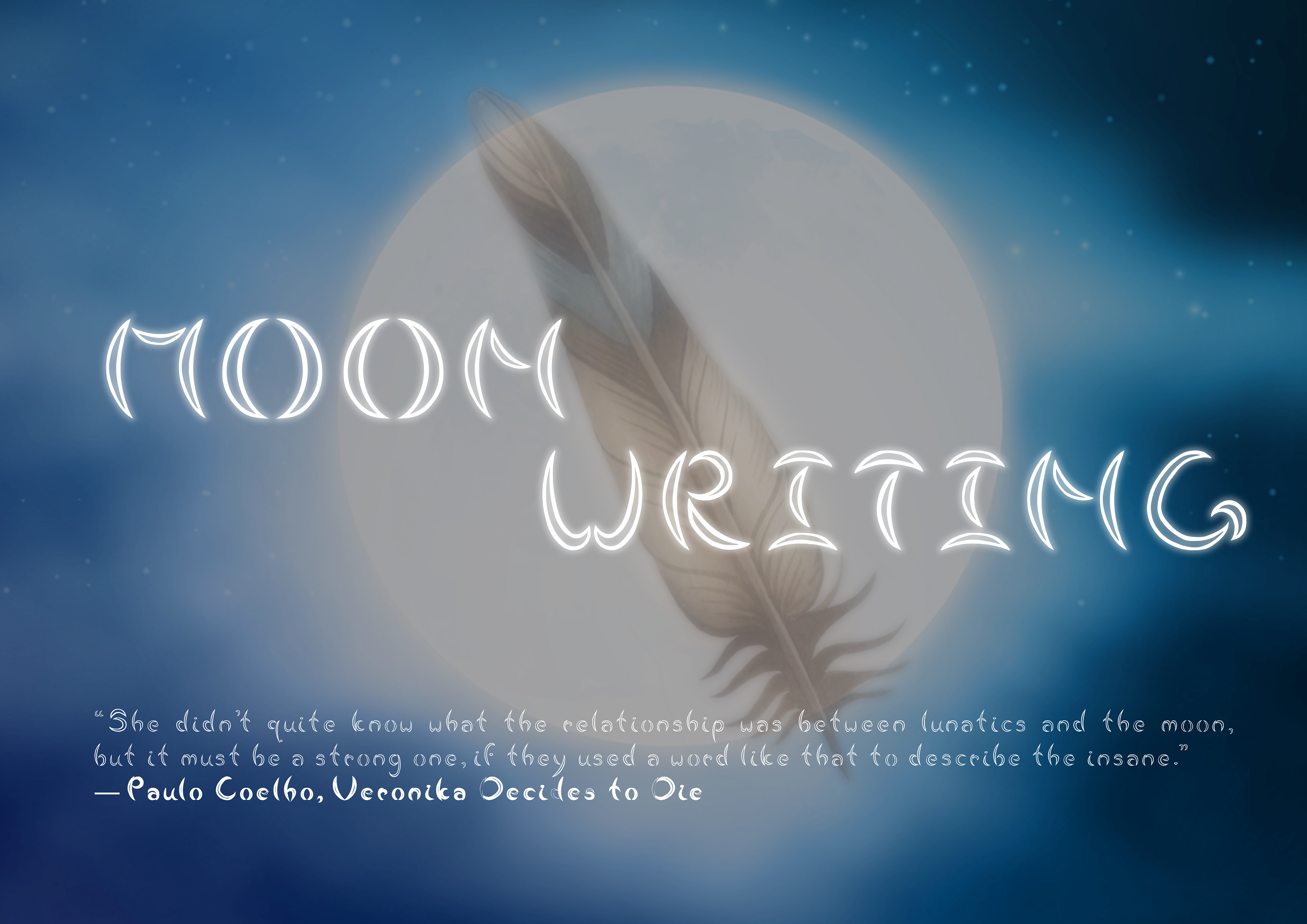
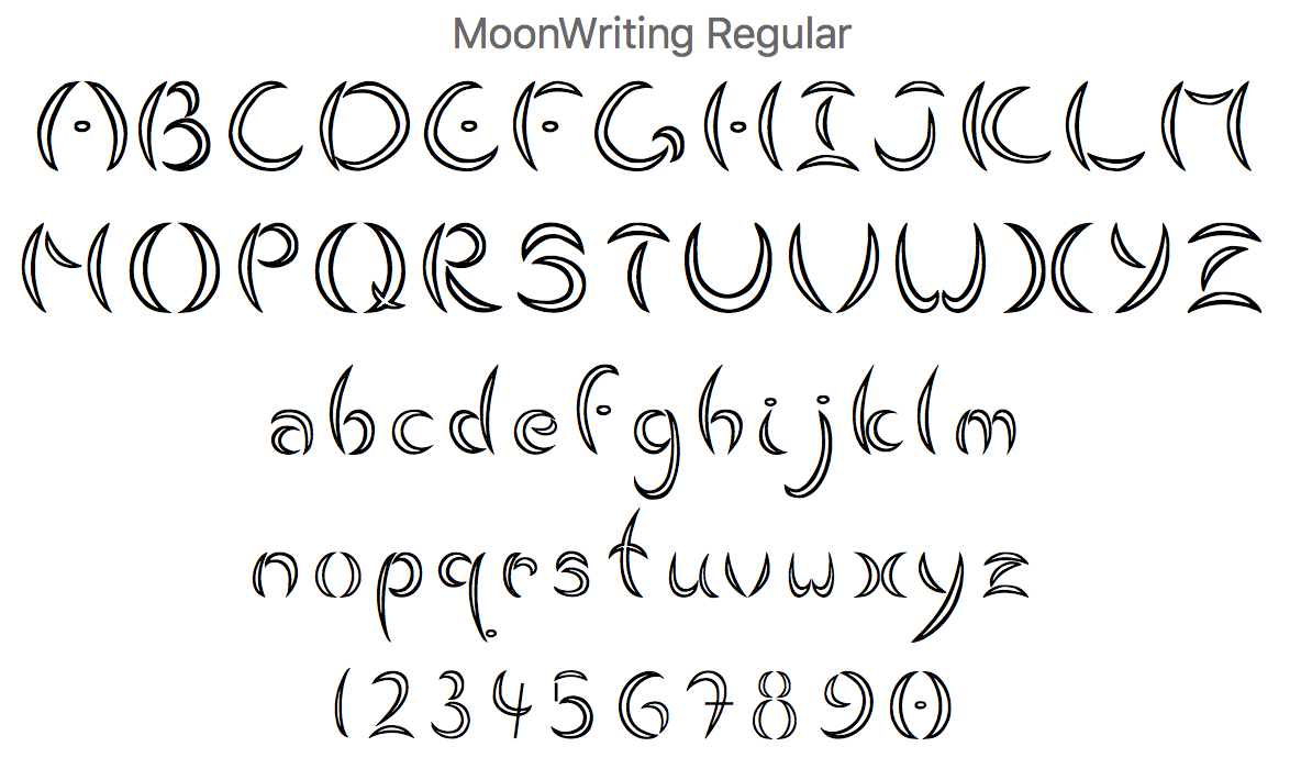
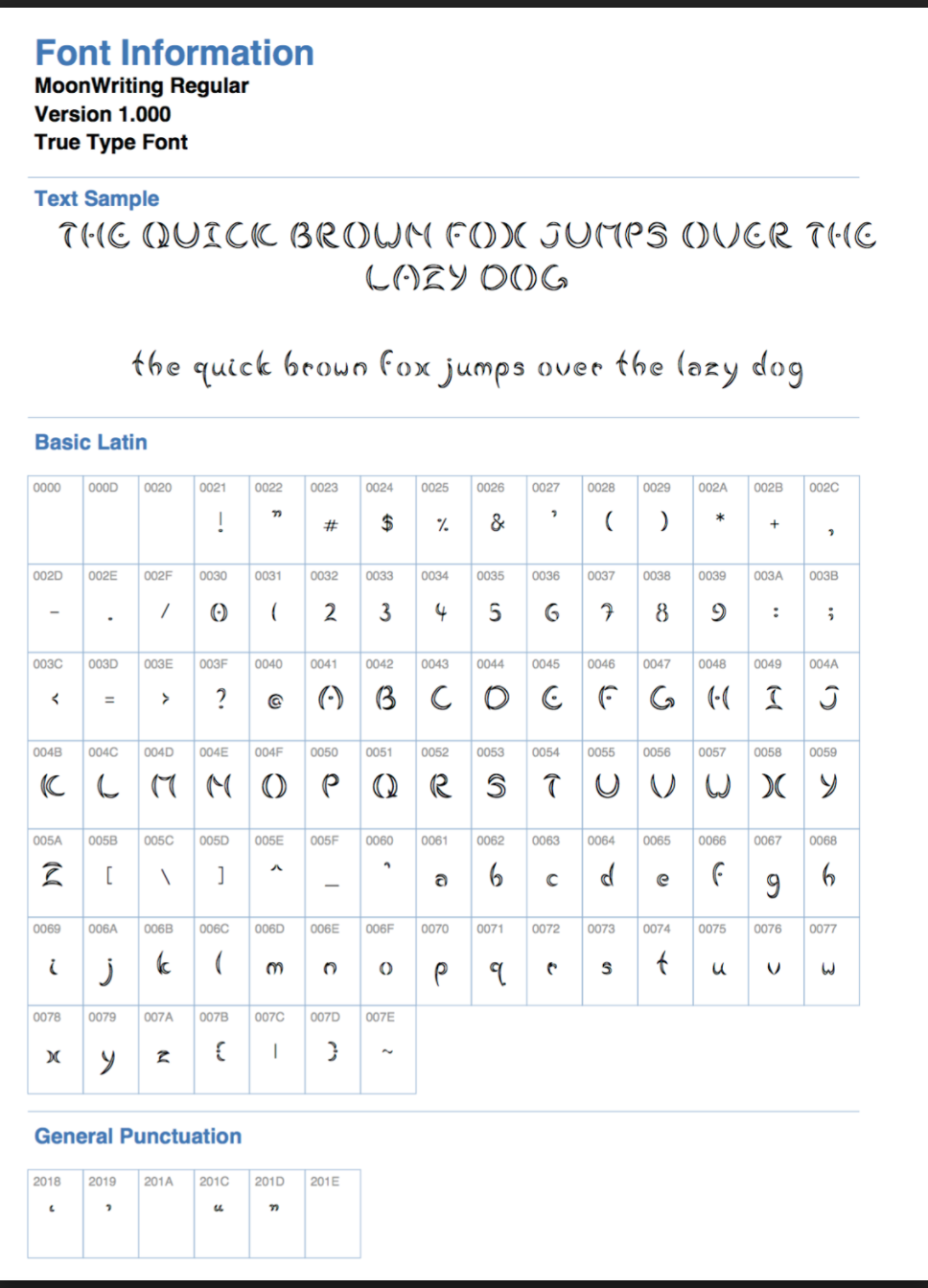
Moon writing is a fully functional True Type Font and it is a display typeface based on shapes of the moon. The shapes of the crescent and full moon was the main characteristic of this typeface. The idea of using spacing for the separation of the strokes is to create a sense of harmony and cleanliness throughout the font as the font originally has a thickness that would create and sense of distraught without the spacing (Nakilcioğlu 2013, 48). The sharp strokes created harshness that counters the curves of the typeface, giving a good balance of both, but also showcasing the two elements and showcased it's genre of supernatural and fantasy.
The type was designed following the shapes that the moon would change into during its different phases. From crescents to a full circle, the shapes presented an idea that was then made into the font displayed. Through this idea, it represents the best and possibly the most suitable typeface to create an effective communication with the concept set for this typeface. With the fact that every typeface carries a different meaning, the message was well-delivered through this typeface. During the design process, the display typeface approach is not meant to be used for scripts, but the typeface designed has a potential to be used as body minimally.
Reference: http://ojad.emu.edu.tr/articles/13/134.pdf
Nakilcioğlu, İsmail H. 2013. "The Effects Of Font Type Choosing On Visual Perception And Visual
Communication." Online Journal of Art and Design, volume 1, issue 3: 35-53.